My Role:
- Sole UI/UX Designer
Duration:
- March 18, 2024 - April 15, 2024 (4 weeks)
Tools:
Design Tools: Figma
Skills:
User Research
UX Design
Interaction design
Usability Testing
Product Strategy
Skills:
User Research
UX Design
Interaction design
Usability Testing
Product Strategy
Overview
EventBite is designed to streamline the process of ordering snacks and refreshments at various entertainment venues, including sports arenas, concert halls, amusement parks, movie theaters, airports, and museums. The app aims to reduce wait times and enhance the overall experience for attendees by offering a convenient mobile ordering solution.
Problem
Attendees at various entertainment venues often face long lines and wait times at concession stands, leading to frustration and the risk of missing parts of events, performances, or exhibits. The current snack ordering process is inefficient and detracts from the overall enjoyment of the experience. There is a need for a solution that allows users to conveniently order and customize snacks from their mobile devices, ensuring a seamless and enjoyable experience across different types of venues.
EMPHASIZE & DEFINE
Understanding user and their needs
Market Research:
Competitive audit (AMC Theatres, Handle, Regal Cinemas) revealed their strengths in
1. offering real-time updates on order status, allowing users to know
exactly when their snacks will be ready
2. allowing detailed customization of snack orders
3. providing exclusive offers and loyalty program integration,
enhancing value for frequent users
1. offering real-time updates on order status, allowing users to know
exactly when their snacks will be ready
2. allowing detailed customization of snack orders
3. providing exclusive offers and loyalty program integration,
enhancing value for frequent users
What was lacking?
These apps are specifically designed for movie theaters and do not cater to other types of venues, such as sports arenas or concert halls. They lack the ability to offer a seamless experience across different venue types, which could significantly enhance user convenience and satisfaction.
User Interviews:
We conducted interviews with attendees of various events, including diverse user groups of different ages, to ask more case-specific questions. Interview questions were framed to understand the current pain points with ordering snacks at these venues, what features they would find most useful in a snack ordering app, and to dive deeper into their overall event-going experience.
"When I go to concerts with my kids, it is a hassle to manage them and stand in line for snacks. By the time we get to our seats, they're already restless"
"Ordering at the concession stands is stressful, especially when it is crowded. I feel rushed to make my choices, and sometimes I end up with the wrong order"
"I don't like handling cash or waiting for card transactions at the venue. It is an added inconvenience that could be avoided with a better organization or system"
User Persona:
Key Findings:
- Long lines and wait times at concession stands are a significant pain point
- Users prefer a mobile solution that allows them to order snacks without missing parts of the events
- Unified Experience: Users expressed a strong preference for a single app that can handle snack orders at various types of events, enhancing convenience and streamlining the process.
__________________________________________________________________________________________________________________________________________
IDEATE
Explore the possibilities
Wireframe: start brainstorming ideas
While brainstorming ideas and sketching wireframes, I focused on clarifying user flows to ensure a smooth and intuitive journey through the app. I aimed to maintain consistency in design elements, such as navigation bars, buttons, and icons, to create a cohesive user experience. Simple navigation was a priority to help users easily find and access different features.
Additionally, I considered the pain points identified during our research, such as long wait times and the need for customization options, to ensure the app effectively addressed these issues.
Lo-fi prototype: thinking and applying psychology principles
In creating my low-fidelity wireframes, I leveraged one of the psychological principles in design to ensure a clear and intuitive user experience, which resulted in a design that was both visually consistent and user-friendly.
- Gestalt principles used: similarity, proximity, figure-ground
This approach helped me prevent common design mistakes such as cluttered interfaces, inconsistent design elements, and difficulty in identifying actionable items, where I organized layout where users could easily identify related elements, recognize patterns, distinguish important elements.
__________________________________________________________________________________________________________________________________________
TEST & PROTOTYPE
Testing - conduct research
Usability Study
In order to evaluate and iterate the usability and effectiveness of this app's prototype, I was observing real users as they interact with the app. The goal was to identify any issues or pain points and gather insights for improvements.
With about 6 frequent event-goers, including parents with children, young adults, and seniors (ranging in age from 19 to 65), I conducted a usability study (both moderated and unmoderated) to answer questions like:
- What features did users dislike or find frustrating about the app?
- Are there any venues or event types users might have expected to see but didn’t?
- How easy or difficult is it for users to navigate through the app?
- Are users able to complete all the tasks without any issues? If not, what obstacles did they encounter?
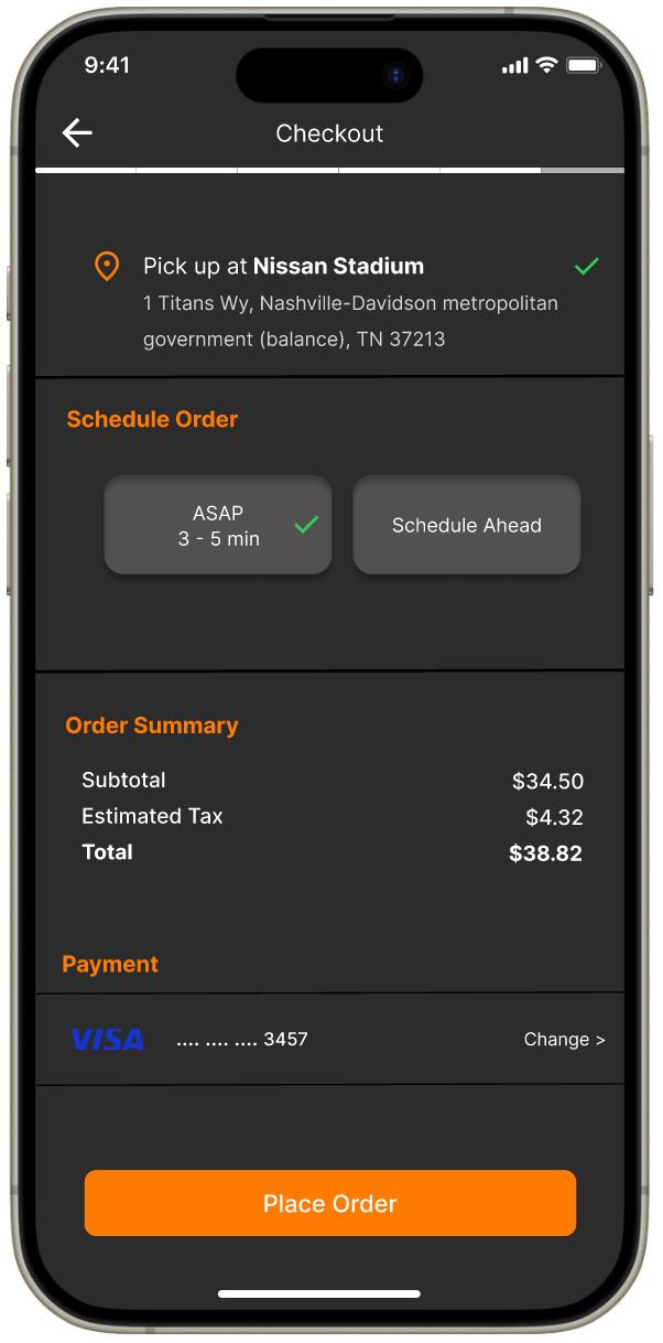
- Are the order review and checkout process straightforward for users?
Affinity Diagram
Repeat and design the framework
Iterate based on feedbacks
1. Add more options
Offer more customization options, special requests for a more satisfying ordering process. It ensure users can easily customize orders to their liking, leading to higher satisfaction and user experience
2. Improve UI and features
Consistent design improves the app’s aesthetic appeal and usability. Enhancing button sizes and adding a tracking option addresses user needs for clarity and next steps
3. Enhance usability and clarity
It improves overall user experience by making app more intuitive, user-friendly, and functional. It ensures that users can easily navigate through checkout/cart process and understand everything efficiently
Hi-fi prototype: branding, usability/accessibility
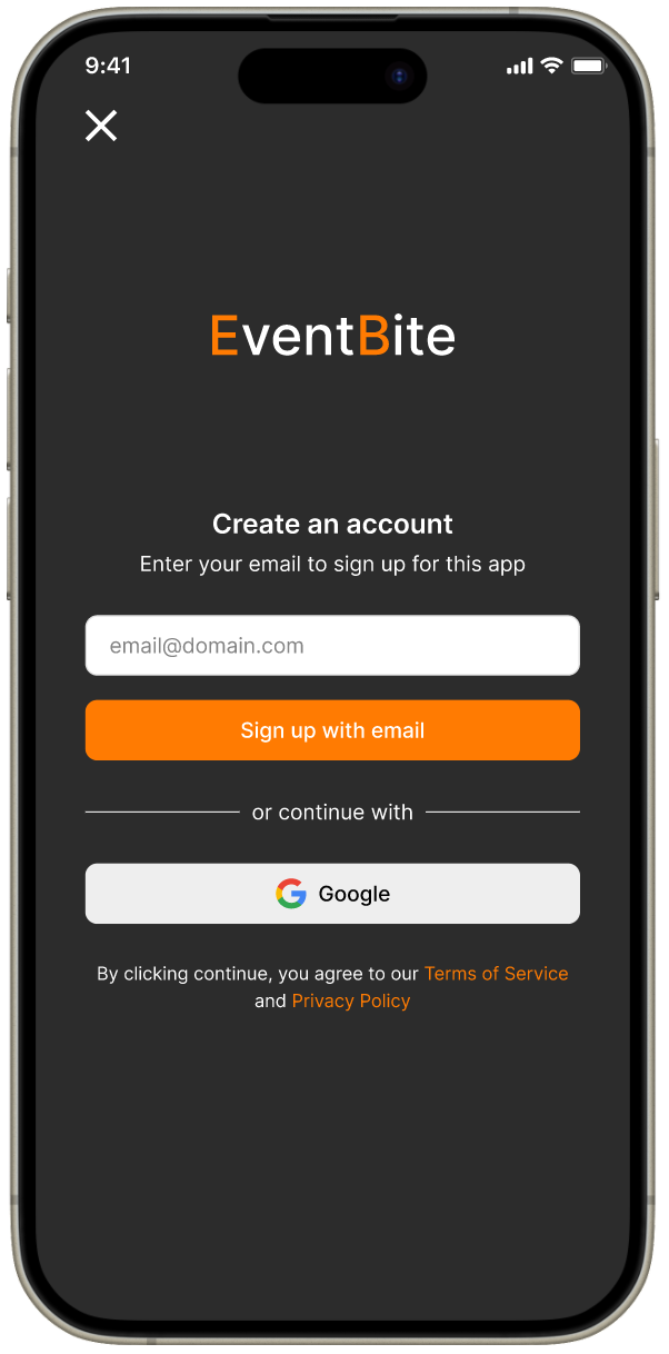
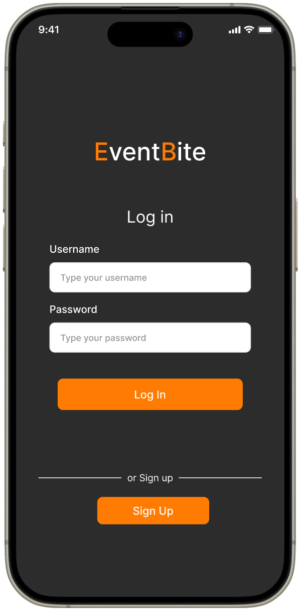
When developing the high fidelity prototype for EventBite, I focused on user engagement, seamless navigation, and accessibility. The goal was to make the snack ordering process as enjoyable and intuitive as possible across various event types. I aimed the app to evoke excitement and anticipation, reflecting the fun of attending events, while ensuring it is user-friendly and visually compelling.
To do this I considered the following:
To do this I considered the following:
1. 60-30-10 rule
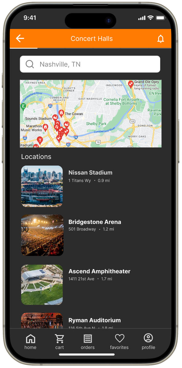
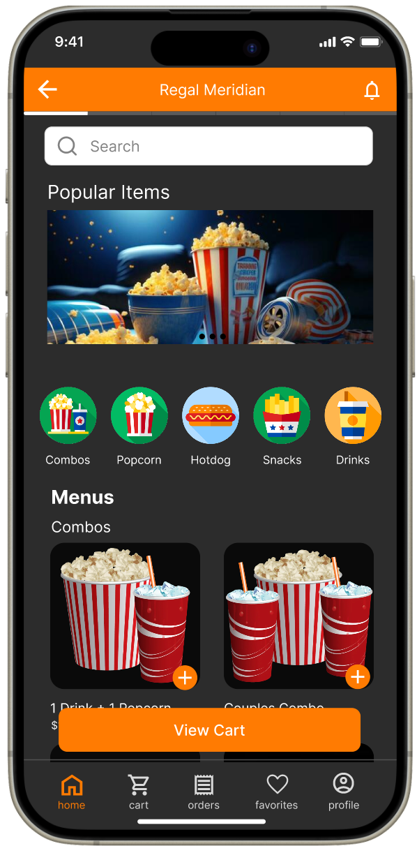
I used dark grey for 60% dominant, orange for 30% secondary, and white for 10% accent. I thought that when the dark background sets a focused tone, keeping the interface clean and minimizing distractions, orange seemed vibrant that draws attention to interactive elements, such as buttons and navigation bars. This was guiding users to take action. Lastly, white accent color ensures that the text and important UI elements are readable and stand out against the dark background.
2. Iconography
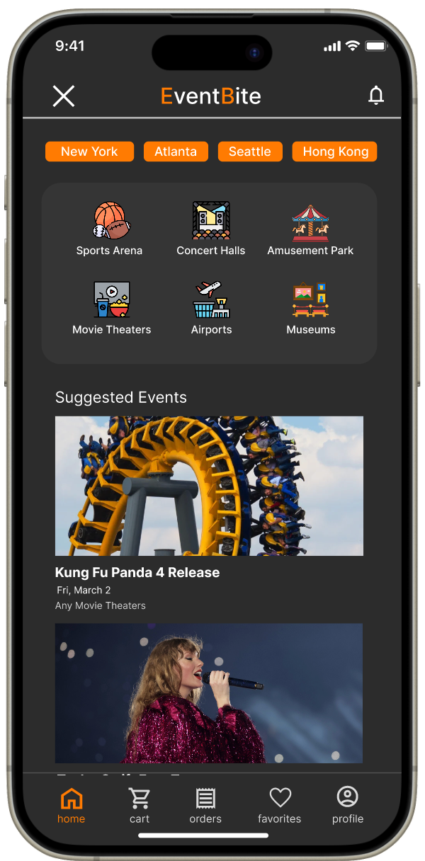
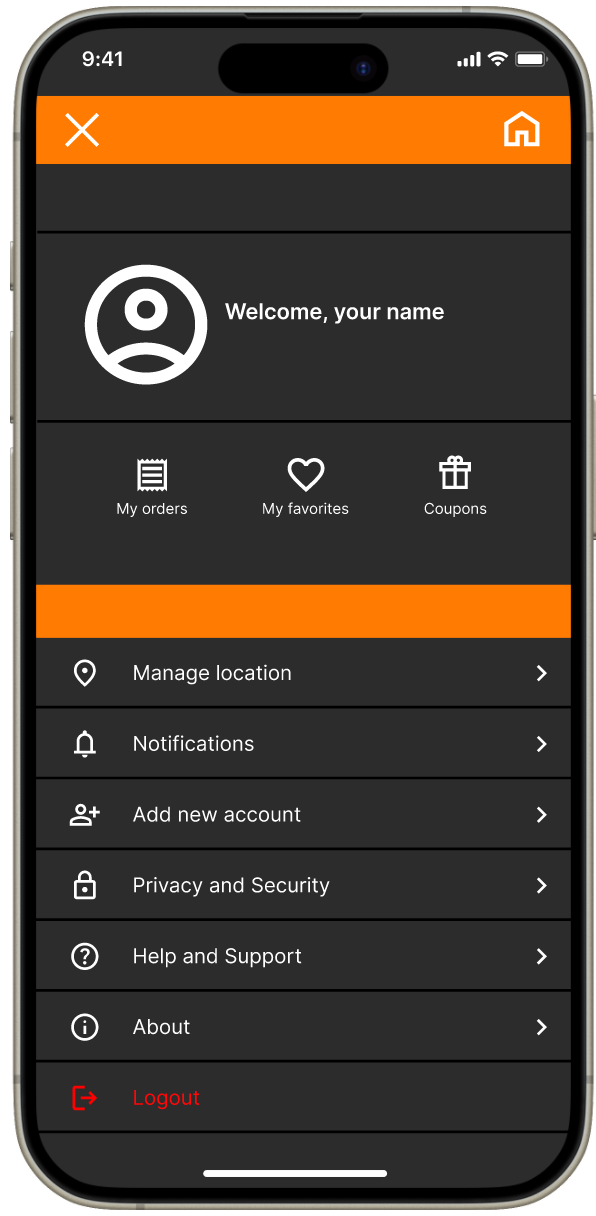
By considering accessibility, we ensured effective use of icons in both the navigation menu and the snack menu (to represent different snack categories). Each icon is accompanied by a label for clarity.
The consistent, clean design of the icons matches the app’s aesthetic, helping users quickly navigate sections. Icons for "My orders," "My favorites," "Coupons," "Manage location," "Notifications," and "Logout" provide clear, intuitive options for managing the account and settings, enhancing the overall user experience.
3. Hierarchy
The size and weight of text and elements are used effectively to create a clear visual hierarchy. Larger, bolder text and elements signify importance and primary actions, while smaller text provides supporting information. Key elements are placed where users expect to find them (e.g., search bar and location selector are at the top, action buttons are positioned centrally or at the bottom)
Test 2 (Hi-fi prototype):
"I found it easy to navigate between different sections of the app. I had no issues completing my order!"
"The app looks very clean and professional. The design of the app have made it much more pleasant to use"
"I love the new icons and visual cues as they make it clear what each section is for"
"All tasks were straightforward to complete, and I didn't encounter any problems this time around."
__________________________________________________________________________________________________________________________________________
Try out the finished product:
__________________________________________________________________________________________________________________________________
REFLECT
What did I learn?
1. Importance of usability testing / user engagement: Usability testing and iterative improvements were very important to refining the app’s functionality and user experience. Continuous feedback allowed us to make necessary adjustments and enhancements. I believe it provides valuable insights that help identify and resolve issues, validate design choices, enhance user satisfaction, and ensure accessibility.
2. Engaging with diverse user base: Including a diverse group of participants (such as parents w/ children, young adults, seniors) provided a well-rounded perspective on the app's usability. Each group offered unique insights that informed design decisions.
3. Organization: Developing a detailed project plan and adhering to a timeline helped keep the project on track. Organizing user feedback and systematically addressing it in design iterations improved the overall quality of the app as well. Effective documentation ensured everything was aligned; This experience emphasized that strong organization skills are essential for successfully managing and executing a comprehensive design project.
As this was my first sole UX/UI design project, I struggled initially with balancing the multiple aspects of design, user research, and iteration. Sorting through and prioritizing user feedback was a bit overwhelming, but I learned to categorize and synthesize it effectively for design decisions. I believe not all design choices were successful, but embracing feedback and learning from mistakes improved the end product. Completing this project boosted my confidence and equipped me with practical UX/UI skills for future projects.
