My Role:
- Product Designer (Group of 3)
Duration:
- July 2024 (50 hours)
- Quick group project for certificate
Tools:
- Design Tools: Figma, Adobe XD
Skills:
User Research
UX Design
Interaction design
Usability Testing
Product Strategy
Presenting
UX Design
Interaction design
Usability Testing
Product Strategy
Presenting
Project Overview
Overview
EduGuide is a tutoring platform designed to help students find tutors and also connect tutors with parents seeking educational support for their children.
Problem
Parents often struggle to find reliable tutors for their children and manage their educational schedules. Similarly, tutors find it difficult to connect with potential students. There is a need for a platform that bridges this gap, providing a seamless experience for parents, students, and tutors.
Goals
1. Create user-friendly platform that simplifies the process of finding, booking, managing tutoring sessions
2. Provide an intuitive interface for parents, students, and tutors, ensuring a seamless experience from searching for tutors to scheduling and conducting sessions
3. Enhance communication and progress tracking between the users to improve educational outcomes
____________________________________________________________________________________________________________________________________________
Preview Final Solution
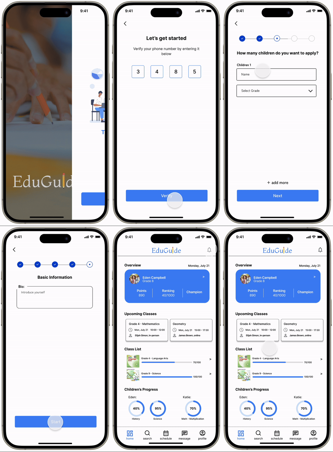
Onboarding
ensure a seamless onboarding experience for all users (students, parents, and tutors) by focusing on clear guidance, user-friendly interfaces
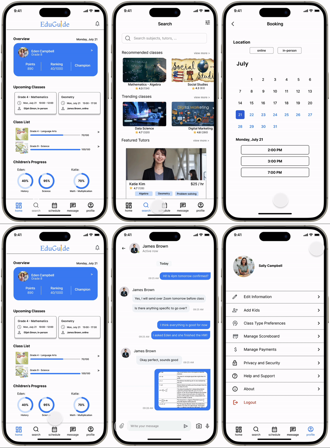
Finding and booking tutoring session
Find classes and tutors you want, read their bio, background, experiences, and availability to continue booking a tutoring session for your kids
In-app communication method
You can manage contacting tutors (if you are parent or student) or manage contacting students and parents (if you are a tutor), and send documents, images, files, etc. for better and effective communication
____________________________________________________________________________________________________________________________________________
Competitive Analysis
Not only did I focus on potential features and user needs for EduGuide, I started to look for opportunities for this app which was more innovative and user-centric. Specifically, to create this platform to effectively connect parents, students, and tutors, I needed to understand the current trends in online education.
I looked closely and analyzed 3 tutoring platforms (WyZant, Soomgo, TutorBird) to see how they operated and positioned themselves in the market. This analysis provided insights into their strengths, weaknesses, and market positioning, helping to identify opportunities and challenges for the app's development.
User Interview
"Finding a qualified tutor who fits our schedule has always been a challenge."
- mom with 2 middle school kids
"Tutoring is boring, I hope there are more fun ways to learn"
- 13-year-old student
"I use different apps for communication, which can be confusing for both me and my students."- Math tutor (10 years)
To gather insights from potential users (parents, students, and tutors) about their needs and challenges, I conducted an interview with 12 users (5 parents, 3 students, 4 tutors) on their experiences and expectations for tutoring services.
The interviews showed that finding qualified tutors, managing schedules, and maintaining effective communication are significant challenges for all users. Additionally, there is a strong demand for a platform that integrates progress tracking and interactive tools to enhance the tutoring experience.
Discovering user needs
Identified Opportunities
- Implementing elements like scoreboard (with leaderboards and rewards) can enhance user engagement and motivation, making the learning process more enjoyable
- Integrate scheduling and communication tools in the app
- Include a progress tracking feature that allows for parents to monitor academic improvements throughout
Problem was to solve 3 main questions:
1. How can we make finding and comparing qualified tutors easier and more efficient for parents and students?
2. How can we manage scheduling and communication between parents, students, and tutors?
3. How can we effectively track student progress?
Ideation
With the research and inspiration, we conducted brainstorming sessions to generate ideas for key features and functionalities. We were thinking about the layout, possible features to include, user interactions, and overall user experience.
Prioritizing design: Key features and User flows
I prioritized based on user needs and feedback since this is crucial for creating a user-centric tutoring platform. I also created a user flow for the tutor matching process, focusing on ease of use and efficiency in connecting students with the most suitable tutors.
First design & mid-fi testing
For first design and testing, I chose to test key user interactions within the platform. This included evaluating how users engage with new features and ensuring a smooth overall experience.
As many features should be similar for all parents, students, and tutors, I specifically focused on 3 important flows: scoreboard, ideal navigation, and effective communication method.
As many features should be similar for all parents, students, and tutors, I specifically focused on 3 important flows: scoreboard, ideal navigation, and effective communication method.
Concept Testing
After initial development, we conducted a comprehensive round of concept testing to evaluate the usability and effectiveness of our first design iteration. The primary goal was to gather feedback from parents, students, and tutors to identify key areas for improvement and ensure the platform meets their needs.
After initial development, we conducted a comprehensive round of concept testing to evaluate the usability and effectiveness of our first design iteration. The primary goal was to gather feedback from parents, students, and tutors to identify key areas for improvement and ensure the platform meets their needs.
Second design & hi-fi testing
After accepting and making changes, we focused on onboarding and refining user interface for the app.
This time, I mainly focused on designing the different features for different users (parents, students, tutors) to meet their unique needs and enhance their specific experiences.
Parents: can search for and book tutors, explore classes, communicate with tutors, and track their children’s performance through a scoreboard. They can also manage child profiles, handle payments, monitor and approve sessions.
Students: can only view their scheduled lessons, message tutors under parental supervision, access learning resources, track their progress, and participate in lessons
Tutors: can create and manage their profiles, update their availability, manage bookings, and communicate with parents and students. They can also share learning resources and plan lessons.
Usability Testing (part 2)
This unmoderated testing was focused on task completion for all different users (parents, students, and tutors). This included navigating the home page, booking classes, sending messages, and accessing progress reports. There were some confusion on filtering and booking classes for parents and finding/managing all students for tutors.
For final iteration, I was focusing on improving navigation, simplifying the booking process, enhancing filtering options, and making class and student management more intuitive.
Final Solution
Parents
(+ onboarding)
(+ onboarding)
Students
Tutor
Conclusion
What I learned
Next Steps
Looking back, I hope I would have focused more on branding and simplifying the design process. Ensuring a strong, cohesive brand identity would have made the platform more recognizable and appealing to all users. Additionally, adopting simpler, more streamlined design approaches could have alleviated the complexity of catering to parents, students, and tutors simultaneously.
By prioritizing the needs of each user group through targeted research and clear communication, the design process could have been more focused and efficient. Establishing a clear and concise design framework before diving into development would have allowed for a more cohesive and user-friendly experience, ultimately making the platform easier to create and more effective for its users.
As we did not have much time for this project, we spent a significant amount of time on the navigation and did not have much time to redesign everything and think more about branding, which we wanted to fix. I want to finalize design enhancements once more and hope my designs help similar future apps.
